WROC# conference is a really unique opportunity for industry specialists, .NET enthusiasts, and all thirsty for knowledge to see well-known and respected experts. Their goal is to bring together bright minds and give inspiring talks that are focused on subjects and issues close to the .NET web developer’s heart.
Objectivity had to create a visual communication for the second edition of WROC# .NET conference. They created a set of prints, fully responsive webdesigns, promo animations and social content based on dedicated illustrations.
The second stage was to implement designs as WordPress theme. Objectivity decided to contact Pagepro and do this part together.
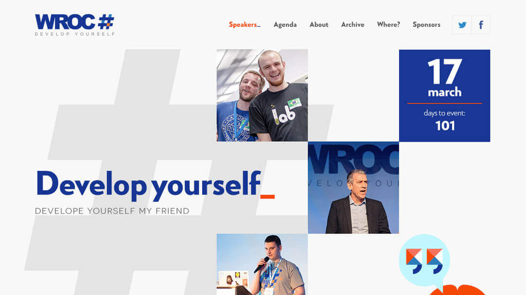
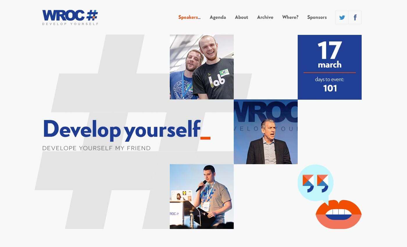
DESKTOP walkthrough
Requirements
- Convert PSD into HTML/CSS templates
- Implement static files into WordPress Theme
- Style Guide Development
- Cross browser & device testing
The Cooperation
Objectivity dev team was fully booked, they needed to focus on projects for their core clients. They decided to outsource whole development part of this project to Pagepro.
Time frame
Whole project took us 6 weeks.
Step 1 Kicking off
As always, first thing was to check if we have all materials. Objectivity provided us well ogranized Photoshop files for web-designs and Illustrator files for vector images.
We've made sure if we have the latest version of the files by presenting them materials summary on FrontendApp (our internal tool), also we've checked if SVG icons are prepared for web-use.
Step 2 Project Architecture
We've listed all sizes, colors, margins, font families and font sizes.
Objectivity provided us specs for animations, so we exported Ilustrator vectors to SVG and started to prepare reusable animations.
All listed items and icons were displayed and explained in first version of style guide.
Step 3 HTML & (S)CSS coding
After preparing project architecutre we started to build HTML & CSS.
BEM Methodology
BEM (Block, Element, Modifier) is an open source technology for developing websites that need to be created quickly and maintained over many years. BEM is used in the front-end development of all Pagepro services.
Well designed SCSS
SCSS structure needs to be well designed and should be refactorized during project life time. Using easy to understand variables for colors and sizes is a must have. It makes code reusable and easier to understand for other developers.
Step 4 Animations
WROC# website needs to be attractive for target audience- developers. We cound't release the project without smooth front-end animations.
On Scroll Animations
Some of website vector images had to be animated on scroll. Two most important animations was: event date block animation (to correspond with WROC# brand identification) and analog clock animation on Agenda Section.
Typing Animations
We have been using Typed.js jQuery plugin to develop typing animations for hero section.
Step 5 Responsive version
We used SASS Breakpoints to create
the tablet and mobile layouts.
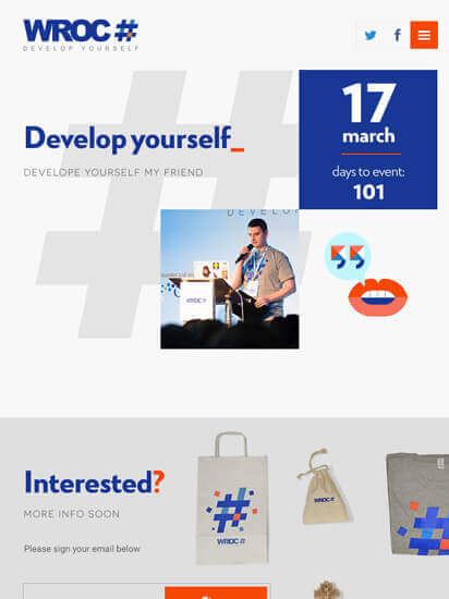
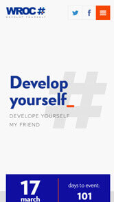
Smartphone walkthrough
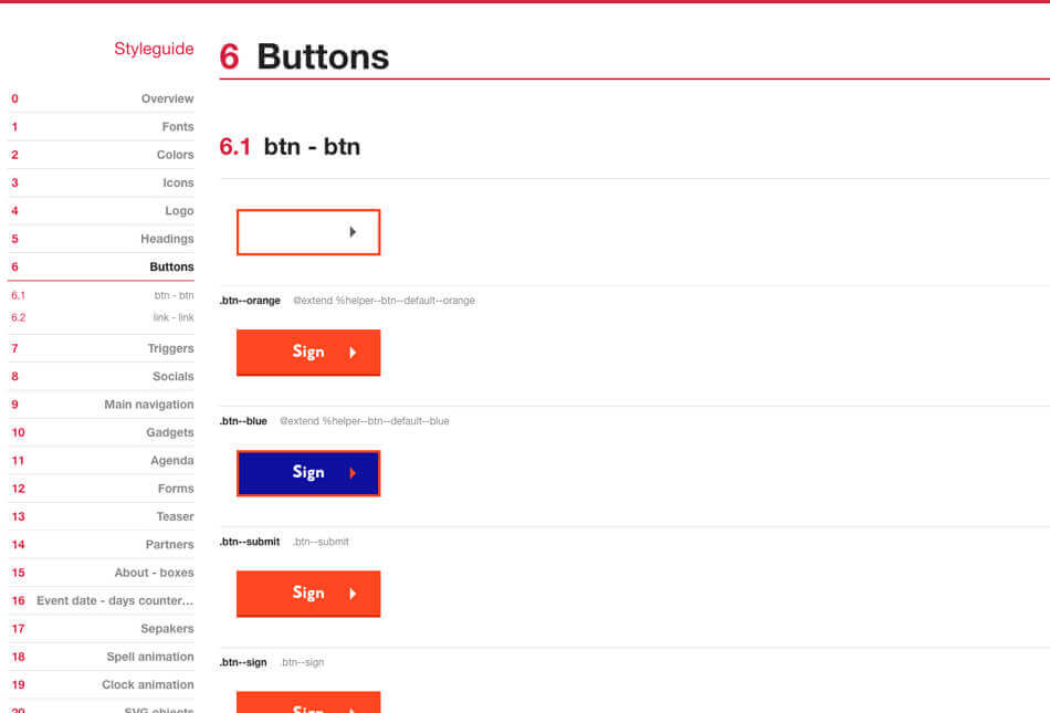
Step 6 Style guide update
Styleguide was been generated automatically based on comments in SASS files. At this stage we've checked if everything generates in correct order and is easy to read and understand.
Styleguide Driven Development is a practice that encourages the separation of UX, Design and Front-end from Backend concerns.
Living style guides are increasingly popular front-end development staples. Integrating a live style guide into your process streamlines workflow, promotes ongoing design cohesion and provides a simple way to visualize how style updates will impact elements site-wide.
Step 7 Fine tuning... and The project is ready!
We did a quality assurance of all pages, then tested the site on mobile and tablet devices. The front-end phase of the project was completed.
We paid attention to both the appearance and the quality of the code, so that it met our coding standards. Finally, we sent a preview of the static HTML files to our client.
Should we get it done?
Let's talk about you now!
Tell us about your challenge, and let's get the ball rolling.
Testimonial:
Very reliable, flexible and uncomplicated. Their team produced great results, helping us kick start our WordPress project.
Have a similar case? Use our experience!
Talk to our expert and see what we can to do push your project further.
