DEKRA is one of the world’s leading expert organisations. The company currently maintains a presence in 50 countries in Western and Eastern Europe as well as in the USA, Brazil, North and South Africa, Israel, Japan and China.
DEKRAs products and services include motor vehicle testing, damage reports, accident analyses and technical reports, safety tests, initial and in-service training, employment agency work, certification, environmental services, materials testing, building surveys, consulting and specialist publications.
More than 37,000 DEKRAs employees are committed to ensuring long-term safety, quality and environmental protection.
The Challenge
DEKRA was looking to extend their existing team to accelerate development speed of their internal web application. They decided to do all front-end related works outside of the company. DEKRA also needed to ensure overall app quality, pixel perfect precision, accessability and stability across all modern browsers.
Requirements
Artur from AF Studio always require pixel perfect precision. He sticks to the grid so working with him is always fun and easy. We've been communicating a lot to set standard sizes (widths, heights) and margins.
Our services contain:
- PSD to HTML conversion
- Style Guide Development
- Gulp tooling automation
- Cross browser & device testing
The Cooperation
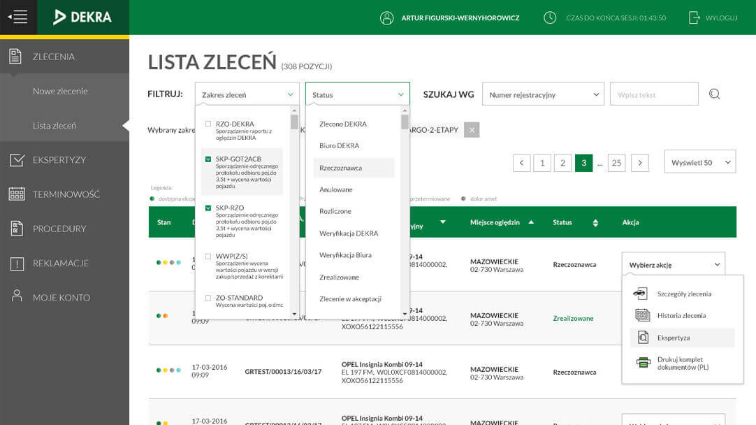
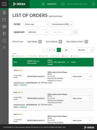
AF Studio for the third time, partnered with Pagepro to create a new desktop and mobile experience for Polish DEKRA internal backoffice called DEKRAnet.
Should we get it done?
Let's talk about you now!
Tell us about your challenge, and let's get the ball rolling.
Time frame
Whole project tooked us 3 weeks.
Step 1 Kicking off
As always, first thing is to check if we have all materials. Artur provided us with 33 JPG & PSD design files and 8 SVG icon files.
We've made sure if we have the latest version of the files by presenting him materials summary on FrontendApp (our internal tool), also we've checked if SVG icons are prepared for web-use.
Step 2 Project Architecture
We've listed all sizes, colors, margins, font families and font-sizes. Artur checked if we can use only these to make project standard variables.
All listed items and icons were displayed and explained in first version of style guide.
Step 3 HTML coding
After preparing project architecutre we always start with building HTML. We are making sure if code is split into tiny, easy to re-use HTML components.
BEM Methodology
BEM (Block, Element, Modifier) is an open source technology for developing websites that need to be created quickly and maintained over many years. BEM is used in the front-end development of all Pagepro services.
BEVM: Chainable BEM Modifiers
Adopting the BEVM convention and (more importantly) introducing chainable modifiers has been instrumental in allowing us to build a super flexible UI Library. This has enabled us to configure our modules in the HTML with a short, concise syntax, reduce the amount of CSS that we need to write and increase our development speed.
Step 4 (S)CSS coding
SCSS structure needs to be well designed and should be refactorized during project life time. Using easy to understand variables for colors and sizes is a must have. It makes code reusable and easier to understand for other developers.
Flexbox Grid System
We have been using Gridle Flex Grid system. This solution is allowing us and client developers to create new, responsive layouts based on our current styles.
Grid system allows to add breakpoints in CSS and also in HTML using classes with suffixes describing RWD breakpoint.
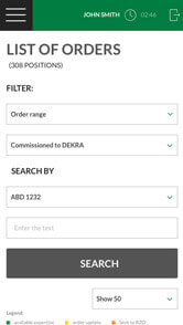
Step 5 Responsive version
We used Gridle Breakpoints to create
the tablet and mobile layouts.
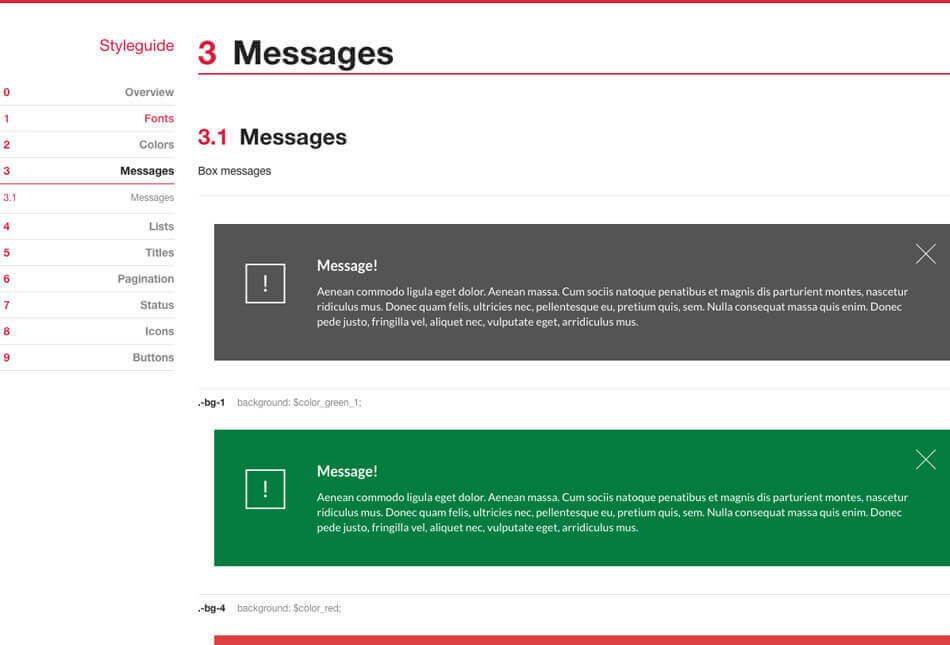
Step 6 Style guide update
Styleguide was been generated automatically based on comments in SASS files. At this stage we've checked if everything generates in correct order and is easy to read and understand.
Styleguide Driven Development is a practice that encourages the separation of UX, Design and Front-end from Backend concerns.
Living style guides are increasingly popular front-end development staples. Integrating a live style guide into your process streamlines workflow, promotes ongoing design cohesion and provides a simple way to visualize how style updates will impact elements site-wide.
Step 7 Fine tuning... and The project is ready!
We did a quality assurance of all pages, then tested the site on mobile and tablet devices. The front-end phase of the project was completed.
We paid attention to both the appearance and the quality of the code, so that it met our coding standards. Finally, we sent a preview of the static HTML files to our client.
Testimonial:
Cooperation with Pagepro is always fast, smooth and efficiency oriented. Coworking, whether it was a small or big project, we have always accomplished our goals.
Have a similar case? Use our experience!
Talk to our expert and see what we can to do push your project further.
